Geometry Of Redistricting Workshop & Hackathon At Duke

Gerrymandering

The MGGG held their 2nd satellite workshop on the Geometry of Redistricting at Duke, 2-5 November 2017. Beyond the fancy name, this was a workshop to learn about gerrymandering (how it is done, how to spot it) and to look at how mathematics can help understand what we see (simple metrics, up to advanced tools). The first two days were devoted to the public workshop and the last two days were devoted to 3 specialty tracks: expert witness training, educator training, and a hackathon. I participated in the Hackathon (my first) and enjoyed the experience thoroughly.

Hackathon

Although the overall Workshop series was lead by Moon Duchin and hosted at Duke by Jonathan Mattingly, the Hackathon was led by Sarah Huggenberger and Blake Esselstyn. We had been given a list of projects in advance and I was looking to work on one that had a connection to the people who were dealing with gerrymandering. The one project that jumped out was called “Preliminary Analyses on Local Election Data”, involving a (new to me) technique called “Ecological Inference”, but importantly it had been requested by a several civil rights groups as a way to look for vote dilution.

Not to get into the weeds too much, but the in the case of Thornburg v. Gingles, the US Supreme Court established the Gingles test, in which 3 conditions needed to be satisfied in order to establish vote dilution:

  1. Geographical compactness of minority group
  2. Politically cohesive minority group
  3. Majority votes as a block in opposition to the minority group

The idea behind this project was to develop a tool that gave the interested parties more insight into whether these conditions had been met, using census and voting data.

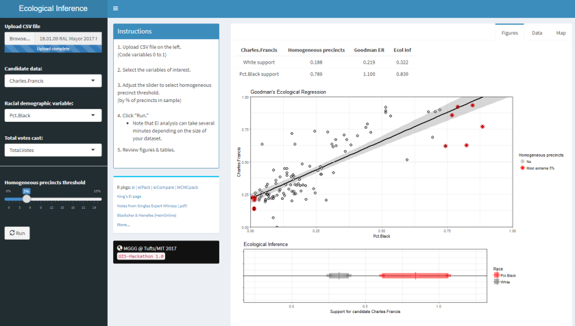
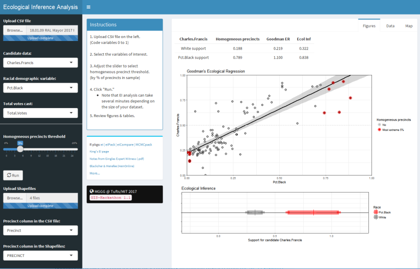
Since we were on the 2nd satellite workshop, a good start had been made by the Hackathon at the 1st workshop and so we had a Shiny app (written in R) as a starting point. It took a file of census and voting information and calculated the white vs black support using three modes of attack:

  • The homogeneous precincts assumption
  • Goodman’s Ecological Regression
  • Ecological Inference
Basic2
Figure 1. Demonstration of the original Shiny app. Sources: 2017 Raleigh Mayoral voting data from Wake Board of Elections, and voting age population by race & ethnicity data by VTD (voting tabulation district) from the NC Legislature “2011 Redistricting Base Data”

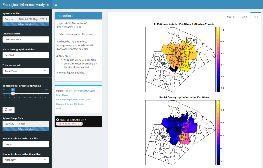
My aspect of this Hackathon was to extend this Shiny app was to add GIS shapefiles and then to map the data for each precinct onto them.

Side-note: Inferring Individual Behavior from Aggregate Data

We want a technique to infer something about a population based on knowledge of only macro information of the size of the population and distribution of the population in the subgroups within a region.

Formally the problem can be written as the number of people in group P doing task Q:

T = β*X  + γ*(1-X)

where

  • T = the proportion of people doing task Q (known)
    • 1-T = the proportion of the people not doing task Q
  • X = the proportion of the people in group P (known)
    • 1-X = the proportion of the people not in group P
  • β = the proportion of people in group P doing task Q (unknown)
  • γ = the proportion of people not in group P doing task Q (unknown)


The simplest solution is to assume that a subset of regions that have above a threshold of a certain demographic proportion (X > 90% or 1-X > 90%, for example) are essentially homogeneous (giving rise to the name Homogeneous Precincts [1]), and to make statements for all regions based on the aggregates of these regions (β = T or γ = T, respectively). The problem with this analysis technique is that there are usually proportionally few regions that satisfy the criteria for the threshold, and the relative sizes of the populations many not be representative of other factors.

Another slightly more complicated solution is to establish upper and lower bounds for β & γ based on the extremes of the proportions on the people in the two groups, known as the Method of Bounds [2].

  1. Assume that none of the people not in group P did task Q (all of the people doing task Q came from group P): set γ = 0 and solve for β = T/X
  2. Assume that all of the people in group P did not do task Q:  set γ=1 and solve for β=(T+X-1)/(X)

Thus we get β = [T/X, (T+X-1)/X] for γ=[0, 1]. While accurate mathematically, it is difficult to answer a question with precision when bounds are involved for every region.

A slightly more robust process is Ecological Regression [2], in which the equation above is multiplied out to give:

T = γ + (β-γ)*X

which is similar to the equation for a straight line in X & T:

T = b + m*X + ε

where ε = a general error term. If data for all regions in question are used as input data for a linear regression, a representative line can be drawn for all regions simultaneously. The hiccup in this process is that “b” can be larger 1.0 or smaller than 0, which can be difficult to explain away to a non-mathematician — “how can you have more votes than people voting?”

A much more robust process is called Ecological Inference [3, 4], which assumes that

  • there is one cluster of points (even if drawn out) on the unit square, following a truncated bivariate normal distribution
  • there is an absence of spatial auto-correlation (the X’s and T’s are mean-independent)
  • the X’s are independent of the β’s & γ’s

and then solves the original equations iteratively for each region to determine best values for β & γ. This technique has been implemented in R in the ei [5] and eiCompare [6] packages.

Additionally, although this side-note only gave the 2 x 2 factor case ([people in group P, people not in group P] x [people doing task Q, people not doing task Q]), the Ecological Inference model has been developed to include the R x C factor case [3].

Results

The process of adding the shapefiles was fairly straightforward, but several design ideas had to be honored:

  1. The original functionality would continue if a shapefile wasn’t specified
  2. The user would be allowed to specify which column in each file denoted the “precinct” for the maps. This was important because the shapefiles tended to have names that were important to the GIS technician who released the file, but could be difficult to change on the fly.

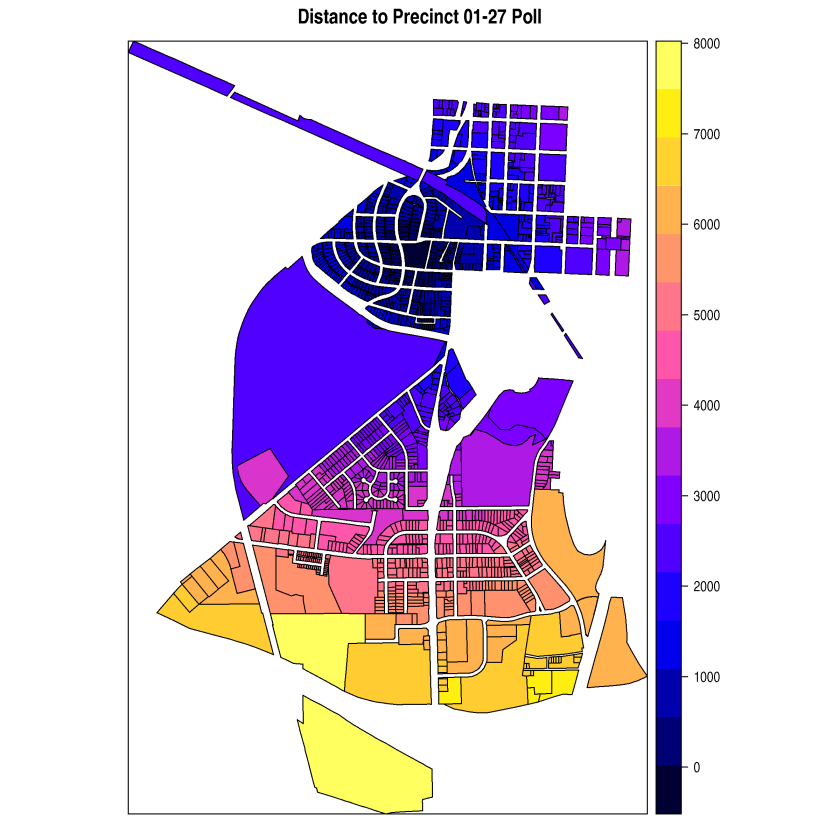
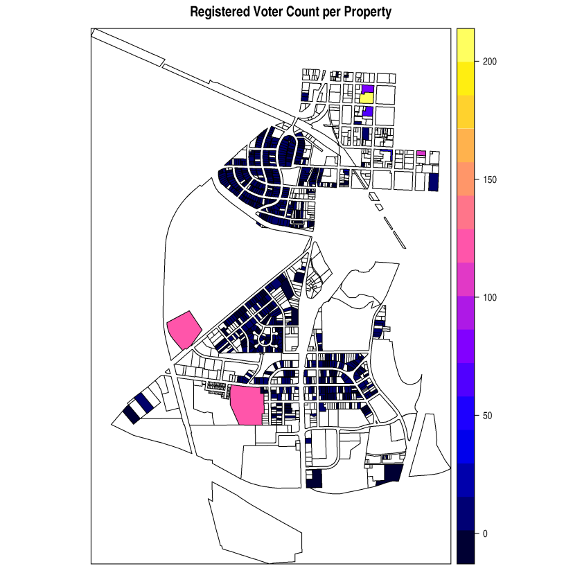
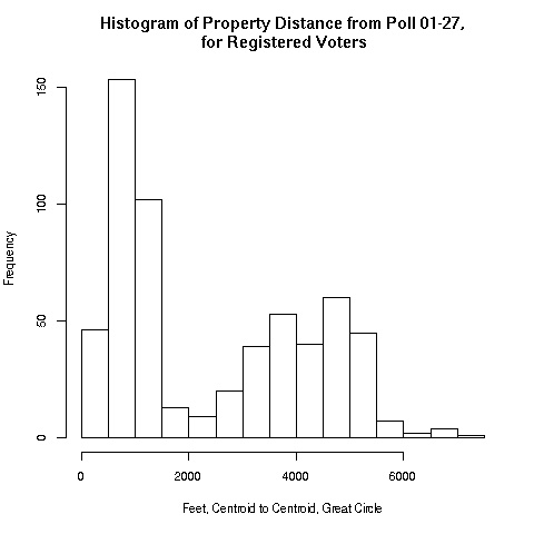
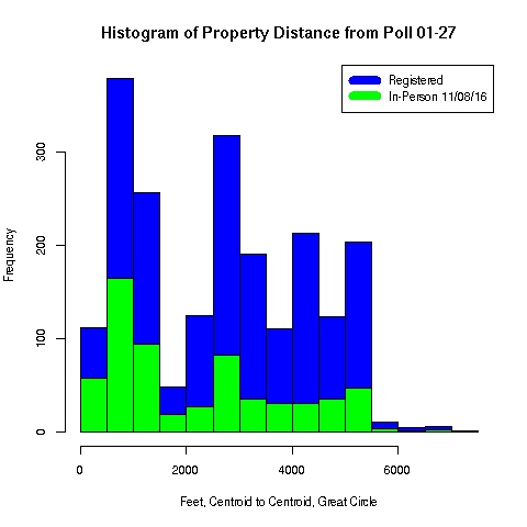
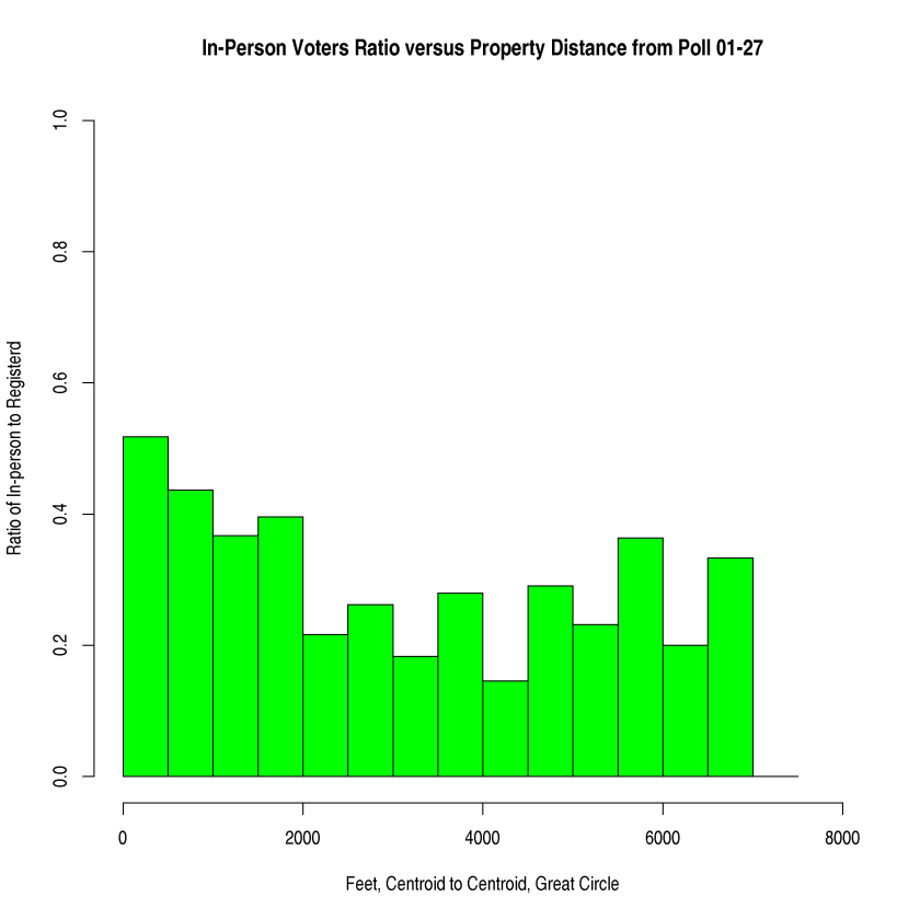
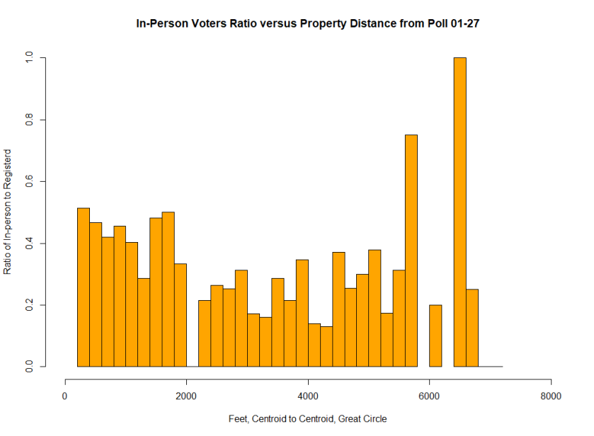
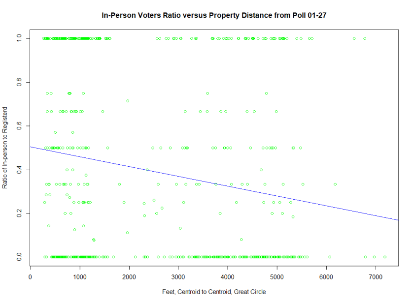
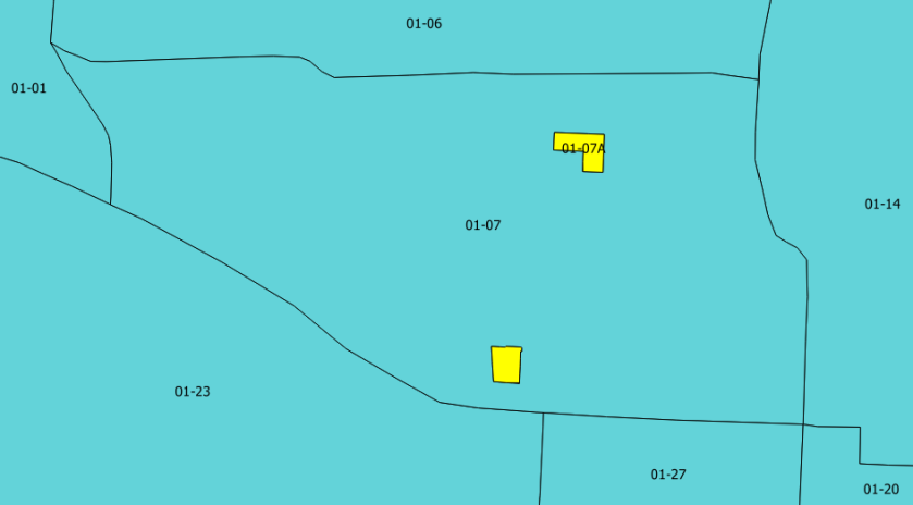
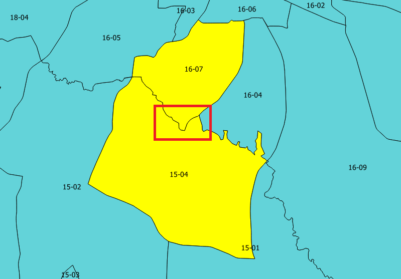
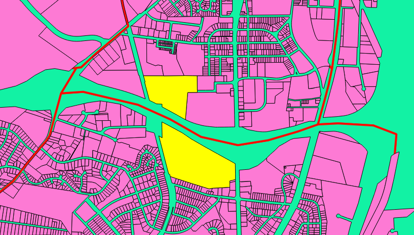
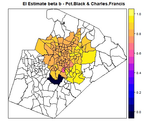
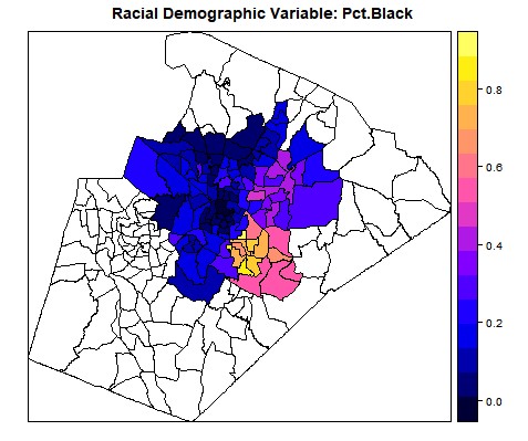
Below are screen shots of the original functionality being preserved and also of the added choropleths. This 2017 Raleigh mayoral election had an interesting twist in that there was one precinct in which no-one voted at all, leading it to be shaded dark blue in the ecological inference choropleths.

New2
Figure 2. Demonstration of the enhanced Shiny app showing basic functionality. Sources: 2017 Raleigh Mayoral voting data from Wake Board of Elections, and voting age population by race & ethnicity data by VTD (voting tabulation district) from the NC Legislature “2011 Redistricting Base Data”


New3
Figure 3. Demonstration of the enhanced Shiny app showing the added choropleths for EI estimated Beta and the Racial Demographic Variable. Note that the precinct that shows as dark blue in the upper choropleth had no voters in this election. Sources: 2017 Raleigh Mayoral voting data from Wake Board of Elections, and voting age population by race & ethnicity data by VTD (voting tabulation district) from the NC Legislature “2011 Redistricting Base Data”
download a
Figure 4. EI Beta estimate for Black voters voting for Charles Francis. Note that the precinct that shows as dark blue had no voters in this election. Sources: 2017 Raleigh Mayoral voting data from Wake Board of Elections, and voting age population by race & ethnicity data by VTD (voting tabulation district) from the NC Legislature “2011 Redistricting Base Data”
download 2a
Figure 5. Percentage Black Residents of Voting Age. Sources: 2017 Raleigh Mayoral voting data from Wake Board of Elections, and voting age population by race & ethnicity data by VTD (voting tabulation district) from the NC Legislature “2011 Redistricting Base Data”

What was done:

  • Added shapefile dialog to GUI
  • Added a no-crash option of there is no shapefile
  • Added common precinct column drop-downs to GUI
    • This is required because we need to be able to join the data from the CSV file to the shapefile and we need to be told which columns have the precinct info in them
  • Made the common precinct column drop-downs modal to having a shapefile selected
  • Forked the data just after it is loaded (to prevent mashing of the original data)
  • Calculated the EI estimate again with Betas TRUE
  • Added plotting of the Betas on the upper map on the MAPS tab (Figure 4)
  • Added plotting of the Racial Demographic on the lower map on the MAPS tab (Figure 5)
  • Added tryCatch to the major operations
  • Added comments and renamed some variables for readability
  • Added 2017 Raleigh Mayoral election data as a data-set (real data!)

There are still some tasks that need to be completed

  • Make the color ramps on the spplots nicer (the default ranges are based on the data, not on the [0, 1] interval)
  • Change the code so that the first ei_est_gen can calculate the Betas (there are a lot of steps to this one)
  • Fix the coercion warnings on the Joins for the Precincts (this will allow the tryCatch to be used)
  • Build a dummy shapefile for and check the data vs cor_6 from the eiCompare package
  • Add the calculated Betas to the DATA tab


Conclusion

Participating in the overall workshop and in the hackathon in particular was a lot of fun. I learned a lot about both gerrymandering also ecological inference. The shiny app advanced and although there are still some open items, a fair amount of progress was made. I’m looking forward to participating in the next Gerrymandr hackathon at Duke and continuing my involvement in the gerrymandering topic in the future.

End-notes:

  1. Ards, S & Lewis, M (1992) “Vote Dilution Research: Methods of Analysis,” Trotter Review: Vol. 6: Iss. 2, Article 9.
  2. Kousser, J. M., (2001) “Ecological Inference from Goodman to King”, Historical Methods: Summer 2001: Vol 34: No. 3, pgs 101-126
  3. King, G., (1997), “A Solution to the Ecological Inference Problem”, Princeton University Press
  4. King, G., Rosen, O., Tanner, M., (2004) “Ecological inference : new methodological strategies”, Cambridge University Press, pgs 6-7
  5. King, G. & Roberts, M., (2016), “Package: ei”, CRAN Repository
  6. Collingwood, L., (2017), “Package: eiCompare”, CRAN Repository

Does Distance to Polling Place Influence Voting?

Introduction

In the wake of the November 2016 General Election in the States, a question arose regarding voter participation: for a registered voter, does the distance to the polling place influence the likelihood of voting? The hypothesis in advance of the analysis was “Yes”, with alpha = 0.05.

Since North Carolina makes voter information (registration, election history, GIS) information available and since Raleigh is in Wake County, the analysis will be focused on a precinct in Raleigh, “01-27”

Method

The first step in this analysis was to obtain the voting data sets from the Wake County Board of Elections and the GIS data (shape files) from Wake County GIS:

Type File Downloaded Description
Voter ncvhis92.zip 12/20/2016 Voting history
Voter ncvoter92.zip 12/20/2016 Voter registration
GIS Wake_Precincts_2015_11.zip 12/20/2016 Each precinct (polygons, data)
GIS Wake_PollingPlaces_2016_09.zip 12/20/2016 Each polling place (points, data)
GIS Wake_PropertySW_2017_02.zip 2/10/2017 Each property in SW Raleigh (polygons, data)

The process steps were:

  1. Determine the properties that lay within the precinct
  2. Calculate the great circle distance from the property centroid to the polling place point
  3. Map of each registered voter in the precinct to the addresses that had distances
  4. Determine the voting status for the candidate election
  5. Organise as a histogram with percentage of registered voters voting vs distance.

Properties within the precinct

This step started out with a cleaning of both the property layer and the precinct layer, as R would occasionally splutter on certain properties. This was followed by an intersection of the properties with the target precinct, given those properties that were at least partially in the precinct:

wakePropPrec0127
Figure 1. Precinct boundaries vs property boundaries.

#set_Polypath(FALSE) <- this was added for the implementation on the Raspberry Pi
setwd("/home/pi/iquantnc/Wake.GIS")
set_Polypath(FALSE)
library(rgdal)
library(rgeos)
library(plyr)
library(sp)
library(plot3D)
#
setwd("/home/pi/iquantnc/Wake.GIS")
#
wakePrec0127 <- readOGR(layer="wakePrec0127", dsn="data")
wakePropSW_clean <- readOGR(layer="wakePropSW_clean", dsn="data")
#
wakeProp0127 <- gIntersection(wakePropSW_clean, wakePrec0127, checkValidity=T)
plot(wakeProp0127)
#
wakeProp0127.list <- gIntersects(wakePrec0127, wakePropSW_clean, checkValidity=T, byid=T)
#
wakeProp.0127 <- wakePropSW_clean[wakeProp0127.list[,1] == TRUE,]
summary(wakeProp.0127)
#
plot(wakeProp.0127)
#
writeOGR(wakeProp.0127, layer="wakeProp_0127", dsn="data", driver="ESRI Shapefile", verbose=TRUE)

Great Circle distance

Having located all of the properties in the precinct, calculating the distances to the precinct polling place was next. This was accomplished via the spDist function in the “sp” package:


wakeProp.0127 <- readOGR(layer="wakeProp_0127", dsn="/home/pi/iquantnc/Wake.GIS/data")
#
wakeProp0127.centroids <- gCentroid(wakeProp.0127, byid=TRUE)
#
wakePoll <- readOGR(layer="Wake_PollingPlaces_2016_09", dsn="data")
#
wakePoll.0127 <- wakePoll[which(wakePoll$PRECINCT == "01-27"),]
#
wakePoll.0127 <- spTransform(wakePoll.0127, CRSobj = CRS(proj4string(wakeProp.0127)))
#
wakeProp0127.PollDist <- spDists(wakeProp0127.centroids, wakePoll.0127)
#
wakeProp0127.PDFrame <- data.frame(wakeProp.0127$PIN_NUM, wakeProp0127.PollDist)
#
wakeProp0127.PDFrame <- rename(wakeProp0127.PDFrame, replace=c(wakeProp.0127.PIN_NUM = "PIN_NUM", wakeProp0127.PollDist = "Poll.Dist"))
#
wakePropPlus.0127 <- merge(wakeProp.0127, wakeProp0127.PDFrame, by="PIN_NUM")
#
writeOGR(wakePropPlus.0127, layer="wakePropPlus_0127", dsn="data", driver="ESRI Shapefile")

wakePrecDist

Mapping voters to addresses

Next the active registered voters were extracted from the voter registration information and also their in-person voting activity:


wakeVoter <- read.table("/home/pi/iquantnc/Wake.Voter/data/ncvoter92.txt", sep="\t", header=TRUE)
sel <- wakeVoter$voter_status_desc == "ACTIVE" & wakeVoter$precinct_abbrv == "01-27"
wakeVoter.0127 <- wakeVoter[sel,]
write.csv(wakeVoter.0127, file="/home/pi/iquantnc/Wake.Voter/data/wakeVoter0127.csv")


In order to check that the voter's postal (street) address could be matched with the property's address (SITEADDR), a quick check was made:

wakePropPlus.0127 <- readOGR(layer="wakePropPlus_0127", dsn="data")
testMatch <- match(wakeVoter.0127$res_street_address,wakePropPlus.0127$SITEADDR)


The exceptions were trapped and resolved by checking property's PIN_NUM via a Wake County mapping application called "iMaps". By typing in the unmatched postal address into iMaps, it was possible to locate the property's PIN_NUM and develop the "wakeVoter2Prop0127_Corrected.csv" file

voter_reg_num,res_street_address,res_street_address_aew,
100513597,1211 LAKE WHEELER RD ,1211 LAKE WHEELER RD,1703344394
100521540,1232 LAKE WHEELER RD ,1232 LAKE WHEELER RD,1703343287
100521536,1232 LAKE WHEELER RD ,1232 LAKE WHEELER RD,1703343287
100530146,1920 S WILMINGTON ST ,1920 S WILMINGTON ST,1702691938
[file truncated]

Voting status for election

The voting history gave the data on who voted “in-person” at the polling place:


wakeVoterActivity <- read.table("/home/pi/iquantnc/Wake.Voter/data/ncvhis92.txt", sep="\t", header=TRUE)
sel <- wakeVoterActivity$voting_method == "IN-PERSON" & wakeVoterActivity$pct_label == "01-27"
wakeVoterIPActivity.0127 <- wakeVoterActivity[sel,]
write.csv(wakeVoterIPActivity.0127, file="/home/pi/iquantnc/Wake.Voter/data/wakeVoterIPActivity0127.csv")

Developing the registered voters vs distance

Each property can have more than one registered voter, so it was necessary to aggregate the total number of registered voters at an address:


#
wakePropPlus.0127 <- readOGR(layer="wakePropPlus_0127", dsn="data")
wakeVoterLookup <- read.csv("/home/pi/iquantnc/wakeVoter2Prop0127_Corrected.csv",header=TRUE)
wakeVoterLookup <- rename(wakeVoterLookup, replace=c(X = "PIN_NUM"))
siteVoterCount <- data.frame(ddply(wakeVoterLookup, .(PIN_NUM), summarize, SiteVoterCount=length((PIN_NUM))))
wakePropPlusVoter.0127 <- merge(wakePropPlus.0127, siteVoterCount, by="PIN_NUM")
plot(wakePropPlusVoter.0127)
plot(wakePropPlusVoter.0127[which(!is.na(wakePropPlusVoter.0127$SiteVoterCount)),], col="Blue", add=TRUE)
writeOGR(wakePropPlusVoter.0127, layer="wakePropPlusVoter_0127", dsn="data", driver="ESRI Shapefile")

The resulting chart is interesting partially for which properties have multiple people registered, but also for which properties have people registered while not being residences.

wakePropReg

Developing the histogram

The last step was to build a histogram of the registered voters, by distance, and one of the registered voters who voted in-person in the “11/08/2016” election, by distance:


wakePropPlusVoter.0127 <- readOGR(layer="wakePropPlusVoter_0127", dsn="data")
hist(wakePropPlusVoter.0127$Pll_Dst[which(!is.na(wakePropPlusVoter.0127$StVtrCn))], main="Histogram of Property Distance from Poll 01-27,\n for Registered Voters", xlab="Feet, Centroid to Centroid, Great Circle")
#
wakeVoterLookup <- read.csv("/home/pi/iquantnc/wakeVoter2Prop0127_Corrected.csv",header=TRUE)
wakeVoterLookup <- rename(wakeVoterLookup, replace=c(X = "PIN_NUM"))
#
wakeVoterIPActivity.0127 <- read.csv(file="/home/pi/iquantnc/Wake.Voter/data/wakeVoterIPActivity0127.csv")
wakeVoterIPActivity16FE.0127 <- wakeVoterIPActivity.0127[which(wakeVoterIPActivity.0127$election_lbl == "11/08/2016"),]
wake16FE <- merge(wakeVoterLookup, wakePropPlusVoter.0127, by="PIN_NUM")
wake16FEActual <- merge(wakeVoterIPActivity16FE.0127, wake16FE, by="voter_reg_num")
#
hist(wakePropPlusVoter.0127$Pll_Dst[which(!is.na(wakePropPlusVoter.0127$StVtrCn))], main="Histogram of Property Distance from Poll 01-27,\n for Registered Voters", xlab="Feet, Centroid to Centroid, Great Circle")
#
hist(wake16FE$Pll_Dst, col="Blue", main="Histogram of Property Distance from Poll 01-27", xlab="Feet, Centroid to Centroid, Great Circle" , ylim=c(0,400))
hist(wake16FEActual$Pll_Dst, col="Green", ylim=c(0,400), add=TRUE)

This results in a histogram of registered voters by distance:

PropDistHisto

Adding in the in-person voters:

PropDistVoteHisto
Figure 5. Histogram of distance to poll for registered voters and for those who voted on November 8, 2016

Results

Putting all of this together, we get a ratio of in-person to registered, as a function of distance:

distBins_L <- seq(0,8000,500)
FEHisto_L <- hist(wake16FE$Pll_Dst, distBins_L, plot=0)
FEActHisto_L <- hist(wake16FEActual$Pll_Dst, distBins_L, plot=0)
ratios_L <- FEActHisto_L$counts/FEHisto_L$counts
ratiosHisto_L <- FEHisto_L
ratiosHisto_L$counts <- ratios_L
plot(ratiosHisto_L, ylim=c(0,1), xlab="Feet, Centroid to Centroid, Great Circle", ylab="Ratio of In-person to Registerd", main="In-Person Voters Ratio versus Property Distance from Poll 01-27", col="green" )
#
distBins_S <- seq(0,8000,200)
FEHisto_S <- hist(wake16FE$Pll_Dst, distBins_S, plot=0)
FEActHisto_S <- hist(wake16FEActual$Pll_Dst, distBins_S, plot=0)
ratios_S <- FEActHisto_S$counts/FEHisto_S$counts
ratiosHisto_S <- FEHisto_S
ratiosHisto_S$counts <- ratios_S
plot(ratiosHisto_S, ylim=c(0,1), xlab="Feet, Centroid to Centroid, Great Circle", ylab="Ratio of In-person to Registerd", main="In-Person Voters Ratio versus Property Distance from Poll 01-27", col="orange")

wakeVoterRatio
Figure 6. In-person voter voting ratio as a function of distance, with bins of 500 ft

At first glance, it appears that there may be a slight relationship between the ratio and the distance, but by shrinking bin width, we get a much spikier plot:

18.01.12 With Smaller Blocks
Figure 7. In-person voter voting ratio as a function of distance, with bins of 200 ft

An alternative to using the histogram is to use linear interpolation of the individual data points:

wake16FE_pollDistanceCount <- data.frame(count(data.frame(as.character(wake16FE$Pll_Dst)),as.character.wake16FE.Pll_Dst.))
wake16FEActual_pollDistanceCount <- data.frame(count(data.frame(as.character(wake16FEActual$Pll_Dst)),as.character.wake16FEActual.Pll_Dst.))
wake16FEActual_pollDistanceCount <- rename(wake16FEActual_pollDistanceCount, replace(c(as.character.wake16FEActual.Pll_Dst. = distance)))
colnames(wake16FEActual_pollDistanceCount) <- c("distance", "n")
colnames(wake16FE_pollDistanceCount) <- c("distance", "n")
#
wake16.regdActualPollDistanceCount = left_join(wake16FE_pollDistanceCount,wake16FEActual_pollDistanceCount, by=c("distance" = "distance"))
wake16.regdActualPollDistanceCount[is.na(wake16.regdActualPollDistanceCount)]<-0
wake16.regdActualPollDistanceCount$nRatio <- wake16.regdActualPollDistanceCount$n.y / wake16.regdActualPollDistanceCount$n.x
wake16.regdActualPollDistanceCount$distance <- as.numeric(wake16.regdActualPollDistanceCount$distance)
#
linearFit <- lm(formula=nRatio~distance, data=wake16.regdActualPollDistanceCount)
#
plot(nRatio~distance, wake16.regdActualPollDistanceCount, xlab="Feet, Centroid to Centroid, Great Circle", ylab="Ratio of In-person to Registerd", main="In-Person Voters Ratio versus Property Distance from Poll 01-27", col="green")
abline(linearFit, col="blue")

18.01.12 Point plot with linear regression

This appears to suggest that the

&gt; summary(linearFit)

Call:
lm(formula = nRatio ~ distance, data = wake16.regdActualPollDistanceCount)

Residuals:
Min 1Q Median 3Q Max
-0.4913 -0.3467 -0.1562 0.5171 0.7994

Coefficients:
Estimate Std. Error t value Pr(&gt;|t|)
(Intercept) 5.044e-01 2.884e-02 17.49 <span id="mce_SELREST_start" style="overflow:hidden;line-height:0;"></span>&lt; 2e-16 ***
distance -4.483e-05 9.517e-06 -4.71 3.09e-06 ***
---
Signif. codes: 0 ‘***’ 0.001 ‘**’ 0.01 ‘*’ 0.05 ‘.’ 0.1 ‘ ’ 1

Residual standard error: 0.4174 on 592 degrees of freedom
Multiple R-squared: 0.03612,	Adjusted R-squared: 0.03449
F-statistic: 22.18 on 1 and 592 DF, p-value: 3.092e-06

This appears to suggest that there is a statistically significant negative correlation between likelihood of voting and distance to the poll in the 01-27 Precinct in Wake County.

Discussion

This analysis, while simple on it surface, ran into some technical issues with the convergence of the GIS and the voting data that were not difficult to solve, but slowed down the analysis process (see Lessons learned from using voter data with GIS data):

  • In NC, it is possible to have special precincts that are not connected,
  • Precinct boundaries can pass through properties,
  • Properties are not always continuous,
  • A property’s physical (GIS) address does not always match the voter registration (postal) address for the people who live there.

The use of histograms initially made the analysis process easier because it gave all of the data on a common axis, but because of the varied nature of the neighborhoods and the distances to the polls, it masked important data. Instead, using a dense plot of points at the various ratios of in-person voting to registered voters meant that the effect of distance could be teased out.

The investigation of one precinct is interesting as a demonstration of the analysis process, but with 203 precincts in Wake County, it is not reasonable to draw a firm conclusion about the influence of distance on in-person voting. The next step for this analysis is to repeat it for the rest of the precincts within Wake county. Although using R to do some of the GIS analysis was time consuming, QGIS and the Python plug-in can be used to make the location/distance calculation process go much faster.

Lessons learned from using voter data with GIS data

In re-doing an analysis from earlier this year, I ran into 4 problems that might be familiar:

  • In NC, it is possible to have special precincts that are not connected,
  • Precinct boundaries can pass through properties,
  • Properties are not always continuous,
  • A property’s physical (GIS) address does not always match the voter registration (postal) address for the people who live there.

As a bit of background, the analysis was looking at the relationship between a registered voter’s distance to the polling place within a precinct and the likelihood that voter would vote in a particular election. The analysis process was to determine the properties that lay within the precinct, to calculate the great circle distance from the property centroid to the polling place point, to map of each registered voter in the precinct to the addresses that had distances, to determine the voting status for the candidate election, and then to organize as a histogram with %of registers voters voting vs distance.

Precinct Not Connected

An example of the first phenomena is the satellite precincts in Wake County, such as “01-07a” or “07-07a”. These are developed to make it easier for elderly or disabled voters to vote in a location different than the regular precinct’s polling site (NC General Satutes §163-130).
seven

The hiccup is these precincts are defined separately from the enclosing precinct and may require special processing in order to yield the hoped for result. In the Wake County Precinct GIS data they can be found by looking for the number of polygons per feature in R:

length(precincts@polygons[[i]]@Polygons)

Trans-property Precincts

The second problem shows up when doing a overlay operation on the GIS information for a precinct and with the properties that should be “in” the precinct, for example in Wake County with the boundary between “16-07” and “15-04”.

six

Looking along the boundary at the southern most edge, there is a small cusp where the precinct boundary turns north but does not follow the property line, almost cutting the property in two.  These exceptions can be detected by finding difference in the list of properties determined to be within a precinct calculated using a “within” operation versus an “intersection” operation.

two

Discontinuous Properties

When a road or highway is planned and built, properties can get divided during the process. Instead of subdividing the properties, they are often left as one entity with an easement for the road or highway, which is good for taxes etc, but a bit difficult when a precinct boundary runs down the road or highway. When a calculation involving the centroid of a property is performed, it is unclear which polygon should represent the property as a whole.

eight

Physical-Postal Address Mismatch

The last problem can be called the “apartment” problem, because it occurs when the property’s address (1234 Easy St) is not the same as the residents address (1234 Easy St Apt #4). If you have the ability to filter out the extra information, great, but the bigger problem occurs when the building is on a corner and the property address is on one street (Easy St) and (for whatever reason) the postal address is on the other (Main St). Identifying that this phenomena exists is fairly easy (since there are voters who are not matched to properties) but tracking it down is a bit harder. For my analysis, I had to manually intervene and used Googles Maps plus Wake County’s iMaps application to track down the correct match. The iMaps application is useful because it uses current deed information and so can see if many people are associated with one property, as in the case of a condominium.

five


Note: I just learned how to use QGIS and was fooling around with the colors etc.